Case Study: Amazon FireOS Design Guide


Project Overview
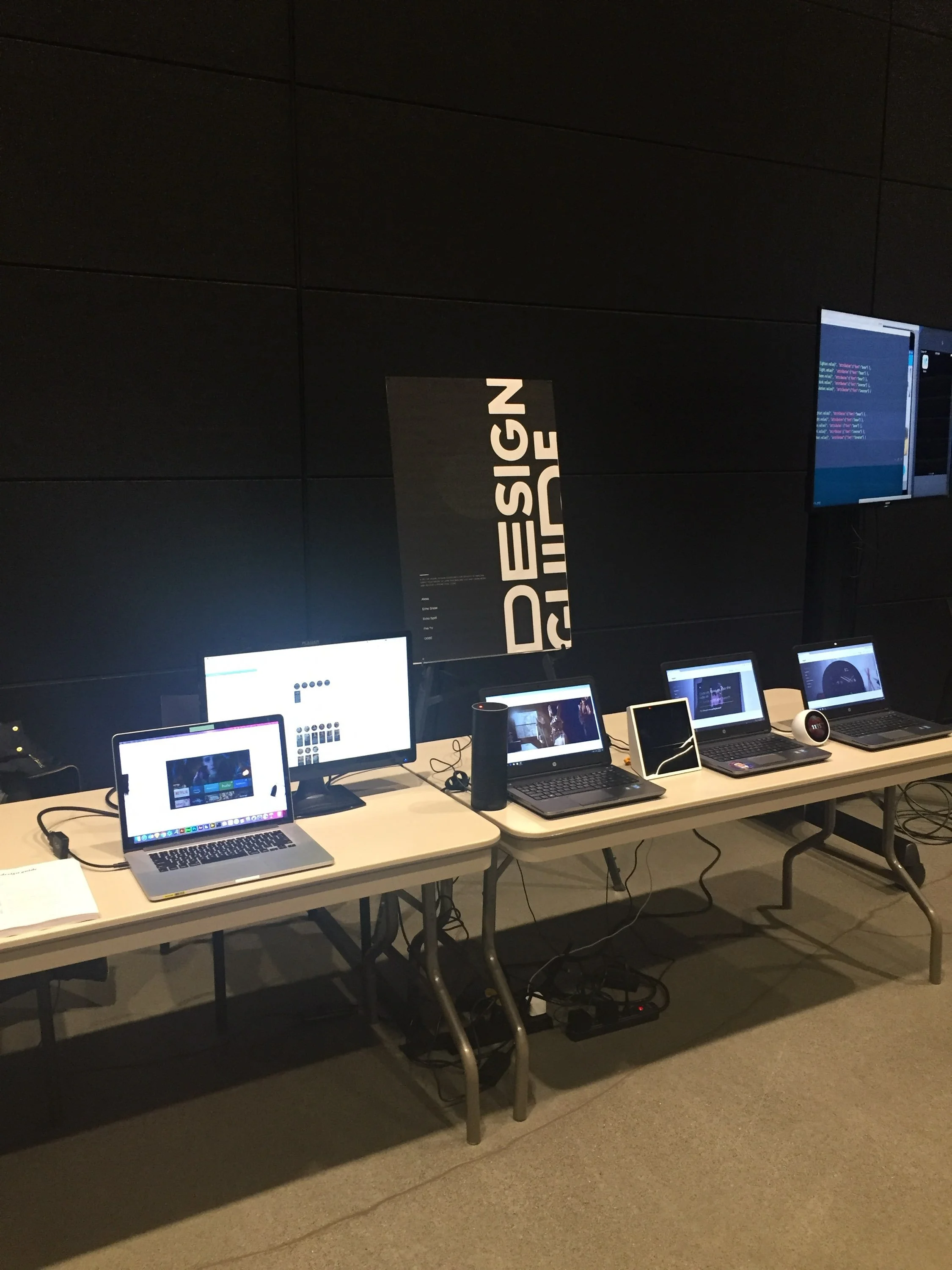
The Devices Design Guide is a design styleguide initiative aimed at creating a cohesive visual and interactive experience across multiple applications within Amazon Devices Group (Alexa, FireOS, FireTV, Tablets). The goal was to establish a consistent design language to improve usability, brand identity, and developer efficiency.
Objective
The primary objective was to develop a comprehensive styleguide that could be applied across various platforms and applications, ensuring consistency in design elements, enhancing user experience, and streamlining the development process. We implemented a CMS and Analytics using Splunk.

Design Process
Persona Development
Based on research, we developed personas to guide the styleguide development:
Alex, the UI Designer: Needs clear guidelines and reusable components to ensure design consistency across applications.
Jamie, the Front-End Developer: Requires well-documented design patterns and components for efficient implementation.
Morgan, the Product Manager: Looks for a styleguide that aligns with brand goals and enhances the overall user experience.
Design Principles
We established core design principles for the styleguide:
Consistency: Ensure uniformity in design elements and interactions across applications.
Clarity: Provide clear documentation and examples for designers and developers.
Flexibility: Allow for customization while maintaining core design standards.
Scalability: Support future growth and integration of new components and features.
Styleguide Components
Design Elements: Defined a set of design elements (colors, typography, spacing) to be used consistently across all applications.
UI Components: Developed a library of reusable UI components (buttons, forms, modals) with detailed usage guidelines.
Patterns and Layouts: Established design patterns for common interactions and layouts to ensure consistency in user flows.
Documentation: Created comprehensive documentation with many cross functional teams including:
Design Guidelines: Instructions for applying design elements and patterns.
Component Library: Interactive catalog of UI components with code snippets and usage examples.
Best Practices: Tips for maintaining consistency and avoiding common pitfalls.
Prototyping and Testing
Prototypes: Created interactive prototypes of key components and patterns to test usability and gather feedback.
Usability Testing: Conducted testing with designers and developers to ensure the styleguide met their needs and was easy to use.
Iteration: Based on feedback, refined the styleguide to address any usability issues and improve documentation.
Implementation
Integration
Design Tools: Integrated the styleguide with popular design tools (e.g., Figma, Sketch) to facilitate seamless use by designers.
Development Tools: Provided code snippets and integration guidelines for developers to ensure consistent implementation.
Training and Support: Conducted workshops and created support materials to help teams adopt and effectively use the styleguide.
Rollout
Phased Approach: Rolled out the styleguide in phases, starting with a pilot project and expanding to other applications based on feedback and refinement.
Feedback Loop: Established a feedback mechanism to continuously gather input from users and make improvements to the styleguide.
Results
Metrics and Feedback
Design Consistency: Achieved a 70% reduction in design inconsistencies across applications, as measured by design audits and user feedback.
Development Efficiency: Reduced development time by 40% due to the availability of reusable components and standardized guidelines.
User Satisfaction: Increased user satisfaction by 30%, based on surveys and usability tests, indicating a more cohesive and predictable experience.
User Feedback
Designers and developers appreciated the clear guidelines and reusable components, which streamlined their workflow.
Positive feedback on the interactive component library and detailed documentation.
Conclusion
Summary
The creation of Devices Design Guide resulted in a unified design language that enhanced consistency, efficiency, and user satisfaction across multiple applications. By addressing key challenges and incorporating feedback, we established a robust styleguide that supports both design, product and development teams.
Future Recommendations
Ongoing Updates: Regularly update the styleguide to reflect new design trends and user feedback.
Extended Training: Provide additional training sessions to ensure new team members can effectively use the styleguide.
Expansion: Explore opportunities to extend the styleguide to new products and platforms as the organization grows.